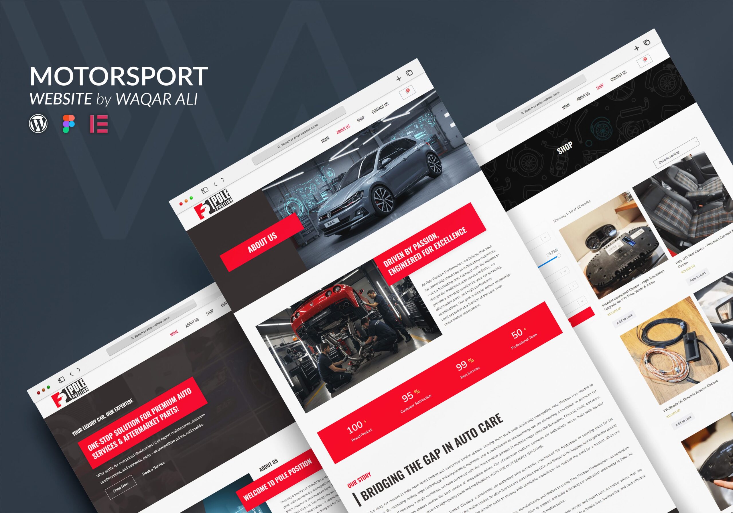
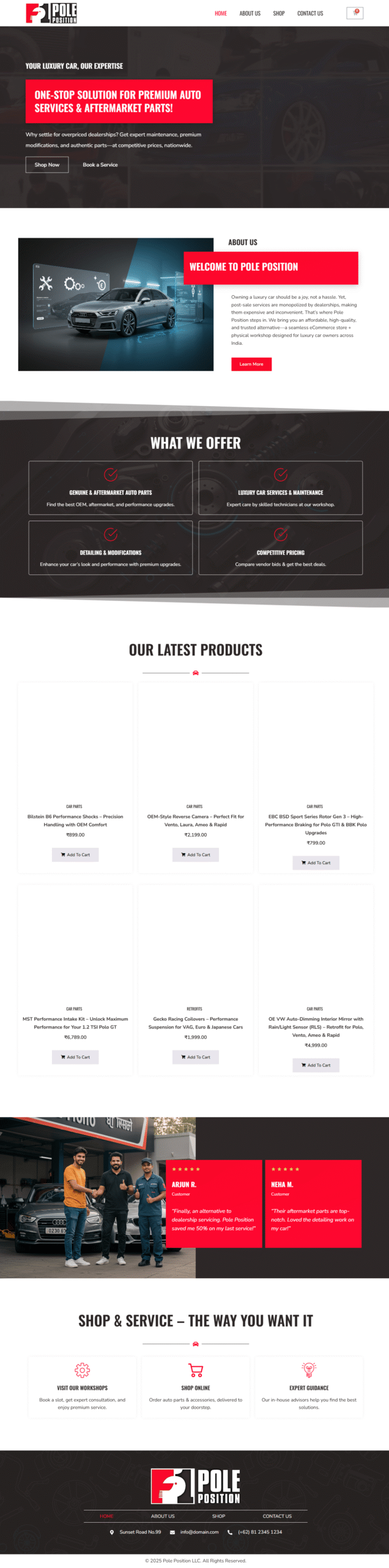
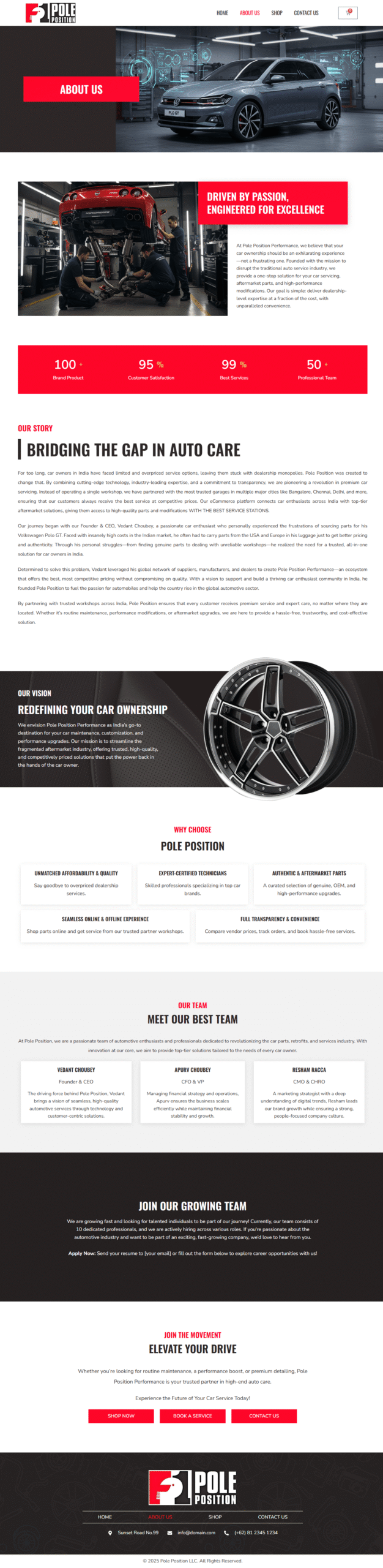
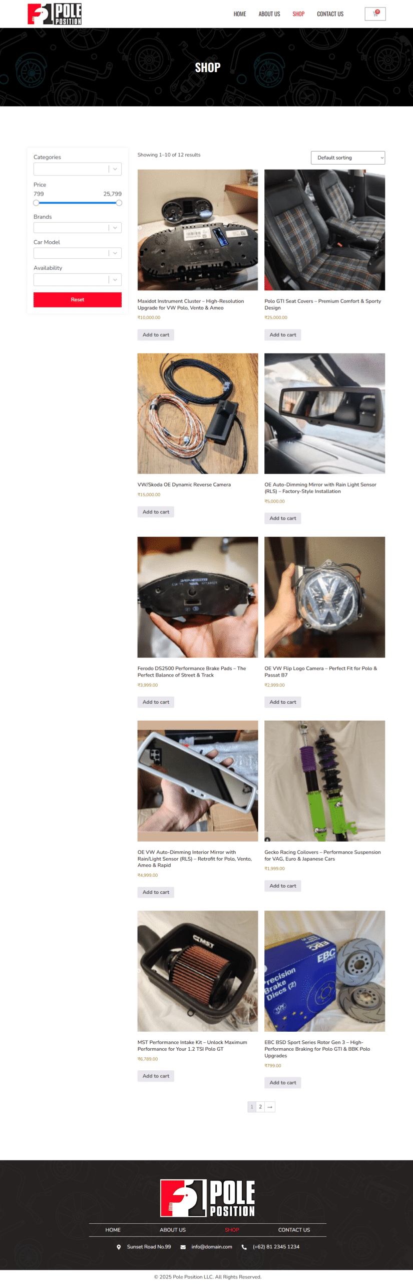
Pole Position is a WordPress-powered platform created to serve a passionate motorsport fanbase with high-quality news, articles, race schedules, and interactive features. The goal was to create a fully responsive, content-rich website that’s fast, scalable, and designed with user engagement at its core.
This platform combines editorial content, event updates, and fan interaction to create a community-driven hub that performs well on both desktop and mobile.
The problem:
While there are many motorsport news platforms, most of them are cluttered, unresponsive, or too generic. Users often struggle with:
Poor mobile experience
Overwhelming ad clutter
Hard-to-navigate content structure
Lack of community features
The goal was to provide a responsive, performance-optimized, and user-first digital product that reflects the energy and speed of motorsports while being effortless to use.
The goal:
Design a responsive, visually immersive layout
Streamline news and event content for easy discovery
Foster fan engagement through forums and comments
Ensure scalable backend architecture for future growth
Optimize performance for fast load times
Verdant
WordPress, Elementor,, Yoast SEO,, Figma
April 2024 - November 2024
UX Designer & WordPress Developer
Target Users: Motorsport fans aged 18–45, primarily male, browsing on both desktop and mobile.
Key Behaviors Identified:
High interest in real-time updates and race schedules
Preference for clean UI without unnecessary clutter
Desire to engage through comments or discussion threads
Competitive Analysis: Benchmarked against sites like Motorsport.com and Formula1.com. Noted gaps in personalization, mobile UI, and community interaction which informed our design goals.
I conducted user research and usability mapping to uncover how motorsport fans consume content online. The focus was on optimizing flow, speed, and engagement—ensuring the platform meets the expectations of an audience fueled by adrenaline and real-time updates.
Structured for speed and clarity. Major sections:
News (by category)
Race Calendar
Community/Forum
Team Profiles
Featured Stories
Created mid-fidelity wireframes in Figma to define layout priorities, content hierarchy, and key interactions like filtering news, submitting comments, and navigating between categories.
Built interactive prototypes to simulate:
Mobile article reading flow
Filtering races by date or type
Engaging in forum discussions
Theme Customization: Started with a lightweight theme and extended it with custom CSS and design tweaks.
Elementor Integration: Used to create pixel-perfect layouts and reusable components.
Advanced Custom Fields (ACF): Created custom post types for race events, team profiles, and featured articles.
SEO Setup: Integrated Yoast SEO for content optimization and search visibility.
Speed Optimization: Enabled caching, lazy-loading, and used compressed images for faster page speed.
Mobile-first Design: All layouts were optimized to perform seamlessly across smartphones and tablets.
Accessible Typography: Chose high-contrast text and readable font sizes.
Navigation: Sticky header, breadcrumb trails, and a collapsible mobile menu.
Based on early feedback and internal testing:
Reduced homepage clutter and surfaced trending articles at the top
Streamlined sidebar widgets for better usability on smaller screens
Added social sharing buttons and a quick-scroll-to-comments feature
A clean, distraction-free UI with well-defined content zones dramatically improves content retention
Community features such as threaded comments and forums are key for long-term engagement
Mobile-first thinking is essential for news-heavy platforms
Your insights, my design thinking—together, we’ll solve it right