Fabcom Digital World

Project overview

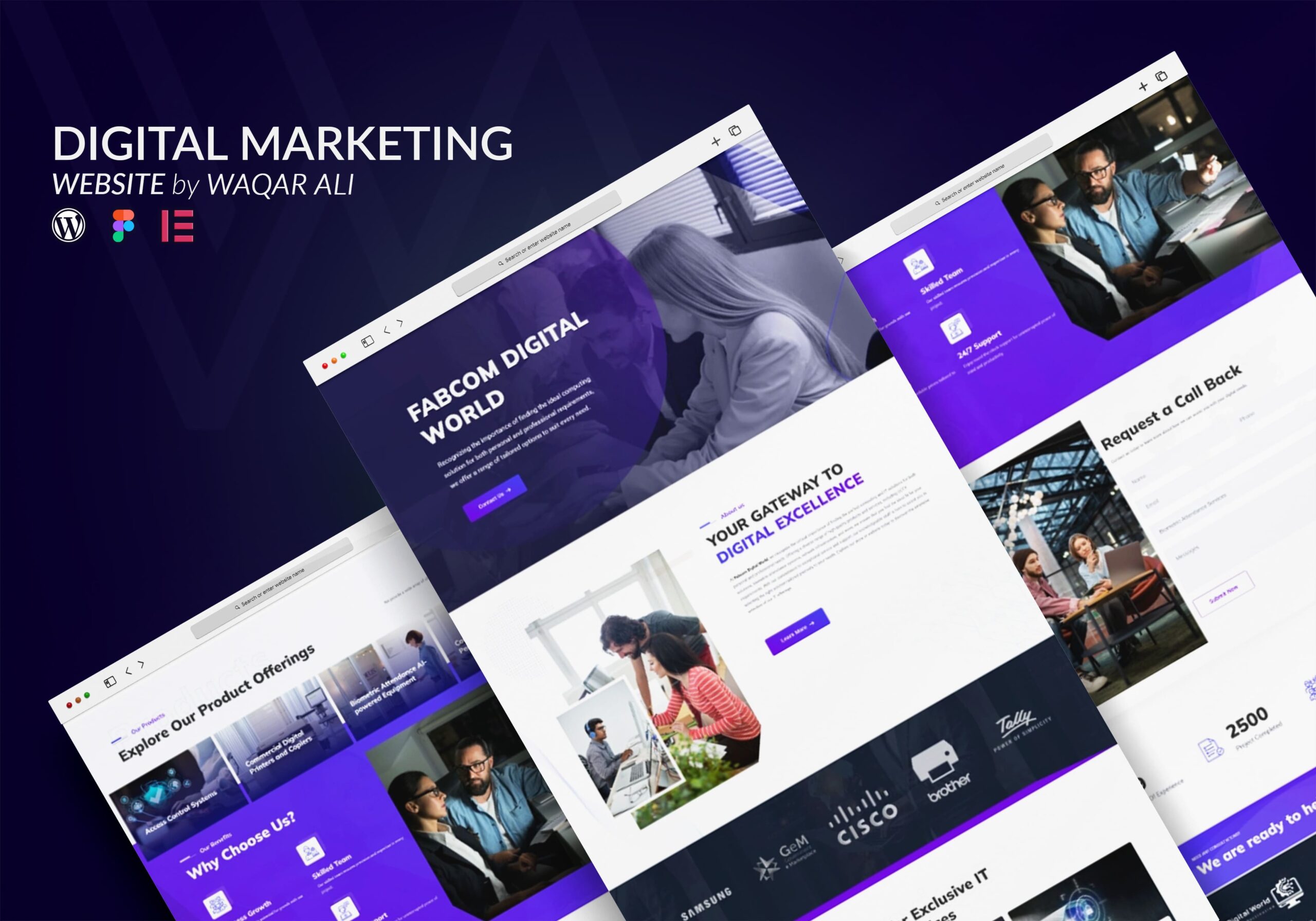
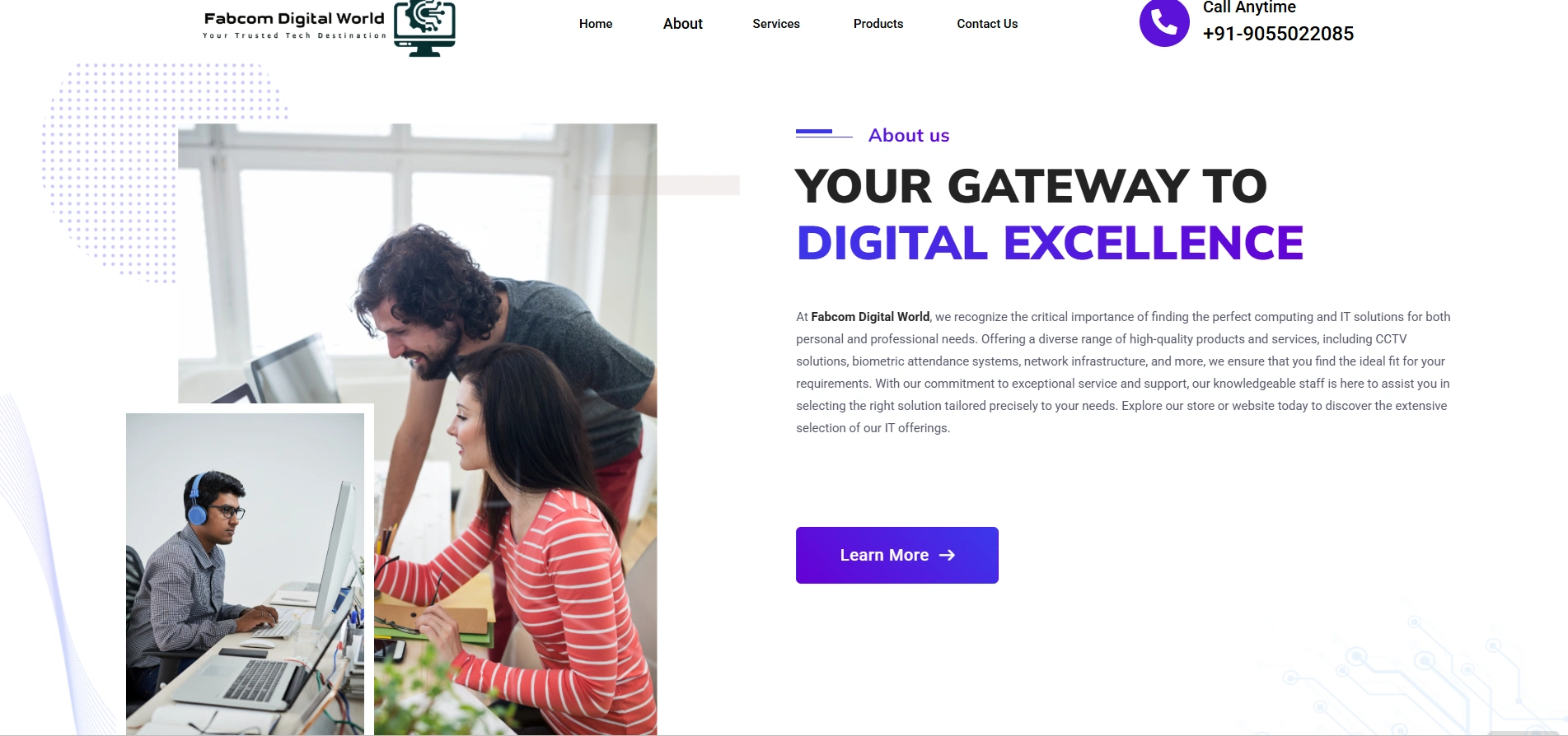
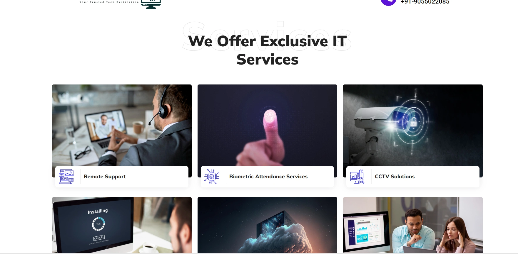
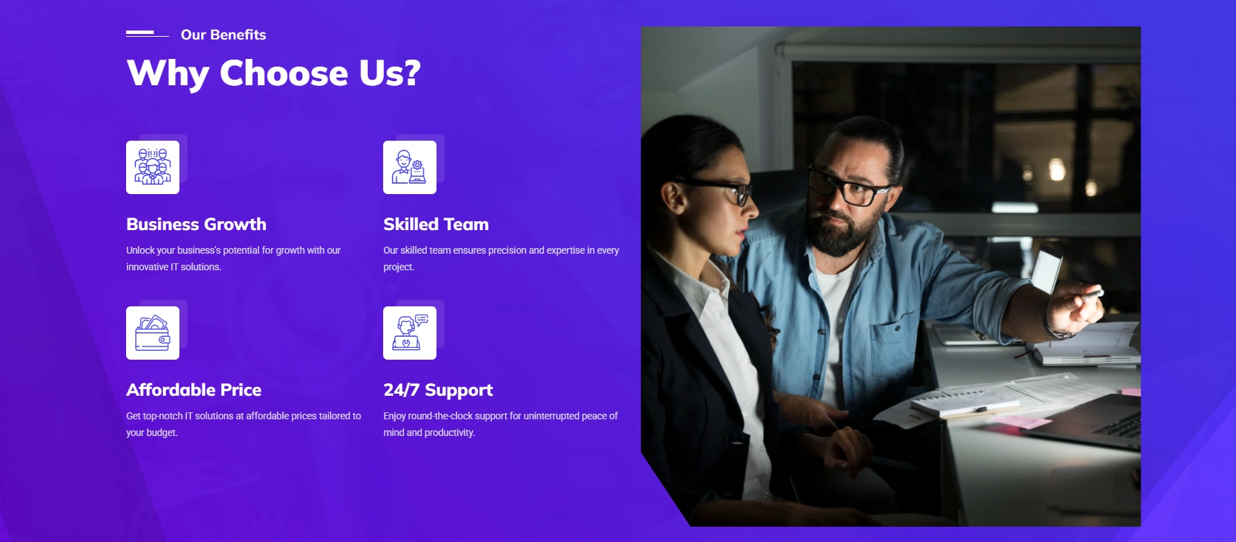
Fabcom Digital World, a fast-rising digital service provider based in the UK, needed a modern, intuitive, and scalable website to match their growing brand presence. With a strong emphasis on services like mobile app development, branding, social media, and eCommerce solutions, they required a digital home that reflected innovation and trust.

Our objective was to design a site that not only showcased their wide array of services but also positioned them as a competent and tech-forward agency. From strategic layout planning to thoughtful UI/UX implementations, we turned their vision into a clean, responsive, and conversion-ready website.

Site Name:

Fabcom Digital World

Platform:

WordPress (Elementor)

Industry:

Digital Agency & Technology Services

Client Location:

United Kingdom

Services Provided: 
  • Brand Identity Consultation

  • WordPress Website Design (Elementor Pro)

  • UX Strategy & Wireframing

  • SEO-Ready Structure Implementation

  • Responsive Optimization (Mobile, Tablet, Desktop)

  • Interactive Forms Integration

  • Custom Iconography and Visual Elements

Goals & Objectives 
  • Develop a sleek, responsive website to reflect Fabcom’s digital edge

  • Present their services and portfolio in a concise yet attractive layout

  • Optimize site structure for SEO and performance

  • Enable easy lead generation via contact and inquiry forms

  • Ensure visual consistency and professionalism across all pages

Design Thinking & UX Strategy

We approached this project with user experience as a priority. Each service was given a spotlight through visual separation and icon-based callouts. The homepage opens with a dynamic hero section conveying clarity and professionalism.
Core UX Considerations:
  • Navigation is minimal and sticky, ensuring accessibility across the site

  • Typography choices maintain visual hierarchy while enhancing readability

  • Each section is spaced generously to promote clarity and breathing room

  • The use of brand-aligned tones (blues, whites, and tech gradients) creates a polished feel

Key Features

Responsive Design Execution

Every page was carefully tested and refined across devices. Mobile-first adjustments included:
  • Collapsible mobile menu
  • Optimized loading performance with compressed media
  • Click-to-call feature integration
  • Grid stacking for easy scrolling on smaller devices

SEO & Technical Optimization

  • Keywords: Digital Agency UK, App Development, eCommerce Services, Branding
  • Meta Setup: Proper use of H1-H3 tags across each page for semantic clarity
  • Speed Optimization: Image compression, caching plugins, and lazy loading
  • On-Page Elements: Alt-text for images, schema markups, and optimized URL slugs

Final Results

  • Bounce Rate Reduced by 42% post-launch
  • Mobile Speed Score (Lighthouse): 91/100
  • Client Satisfaction: “Our website finally reflects our brand values. It’s clean, engaging, and helps us close more inquiries!”
  • Conversions: Form submissions doubled in the first 3 weeks

Future Enhancements (Planned)

  • Blog Integration for SEO
  • Dynamic Portfolio Section (case-based filtering)
  • CRM integration for leads tracking

Thank you for viewing my project. I’d love to hear your thoughts or answer any questions you may have. Feel free to reach out!

Contact Me

Whether you’re curious about my work, want to discuss a project, or just say hello—I’d love to hear from you. Let’s connect and create something great together.